
Floors That Guide Without Tripping the Eye
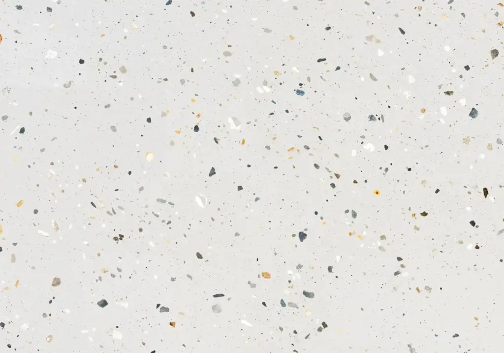
Use slip‑resistant materials with linework that remains legible under scuffs. Terrazzo with colored aggregates, durable vinyl planks with inlaid ribbons, or epoxy paths can carry a consistent hue storewide. Aim for strong light‑reflectance contrast between path and adjacent field, yet avoid patterns that strobe or fatigue. Keep turns generous and curves smooth to cue comfort. When budgets are tight, test removable decals to validate curves and widths, then commit to permanent finishes once flow and wear patterns confirm success.

Walls, Fixtures, and Quiet Reinforcement
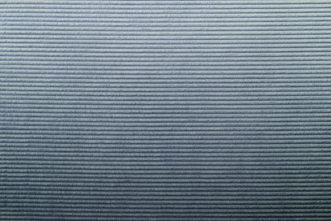
Backer panels can hold saturated accents while primary walls stay calmer, protecting the eye from overload. Powder‑coated fixture trims repeat key hues, so even a simple shelf communicates zone identity. Texture shifts help non‑color readers: ribbed slats for tech, woven panels for home, smooth laminates for beauty. Every detail whispers the same message. Create a materials legend and share it with vendors to prevent off‑shade substitutions that erode clarity. Audit quarterly to keep finishes aligned across expansions and remodels.
Lighting as the Fourth Surface
Treat light as paint. Warm the main path to energize, cool evaluation bays for color accuracy, and spotlight newness with crisp accents. Tunable white and discreet RGBW grazers can nudge perception without carnival effects. Avoid glare that flattens color, and keep vertical illumination high enough to read faces and signage. Schedule scenes that adapt to seasons and traffic patterns. Record shopper comments when scenes change; authentic reactions often validate what spreadsheets cannot, guiding investments toward the most felt improvements.