
Follow the Colors: Finding Your Way Through the Workplace

Step into a smarter workplace journey. Today we explore color-coded wayfinding in modern office layouts, turning intuitive palettes into practical paths that reduce stress, shorten detours, and welcome visitors with confidence. Expect psychology, planning frameworks, material choices, hybrid digital tools, real stories, and clear actions you can apply this quarter. Bring your questions, share your own signage wins or missteps, and let’s build a system that helps everyone arrive relaxed, prepared, and on time.
How Color Guides the Brain at Walking Speed
Colors work like beacons our eyes recognize before words, especially when we are moving and making quick decisions. Saturation, contrast, and placement shape attention, while consistency turns single hints into a trustworthy language. Understanding perception, memory, and legibility helps craft corridors and intersections that feel natural, safe, and welcoming, even for first-time visitors navigating unfamiliar spaces under time pressure.
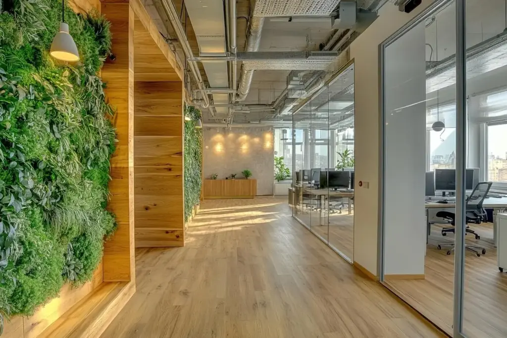
From Floor Plan to Palette: Designing the System
A successful navigation system begins with understanding journeys: where people enter, converge, hesitate, and split. Map primary routes, secondary shortcuts, and local loops. Choose a palette with enough distinct hues and value steps to remain legible across lighting conditions, surfaces, and distances. Align with brand personality without sacrificing clarity, then document rules that endure beyond individual projects.
Materials, Surfaces, and Light
Color lives on surfaces that must survive footsteps, carts, sun, and cleaning chemicals. Consider texture, reflectance, and viewing distance when choosing paint, films, laminates, powder coat, or flooring inlays. Pair those choices with lighting that preserves hue accuracy and contrast. Durable, maintainable materials keep the system crisp and credible long after the grand opening photos fade.
Finishes That Endure
High-traffic corridors benefit from scrub-resistant paints and anti-scratch films. Floor stripes should use slip-resistant, high-bond materials compatible with maintenance schedules. For fixtures, powder-coated metals protect saturation and edges. Specify gloss levels to control glare. Provide touch-up kits and color codes to facilities staff, ensuring prompt repairs that prevent frayed lines from undermining trust in the signals.
Lighting That Respects the Palette
Even perfect palettes fail under poor lighting. Aim for high CRI to maintain hue distinctions and choose correlated color temperatures that complement finishes. Audit hotspots and shadows that distort contrast at decision points. Coordinate with daylight controls so cues remain stable from morning to evening. Reassess after fixture changes; illumination upgrades can subtly shift perceived readability.
Sustainable Choices
Select low‑VOC paints, recyclable films, and substrates with environmental product declarations. Favor modular components that can be swapped without landfill waste during rebrands or reorganizations. Durable materials reduce replacement frequency, lowering embodied carbon over time. Document responsible cleaning methods that preserve finishes. Sustainability here is practical: a clear, long-lived system saves resources while safeguarding everyday clarity.
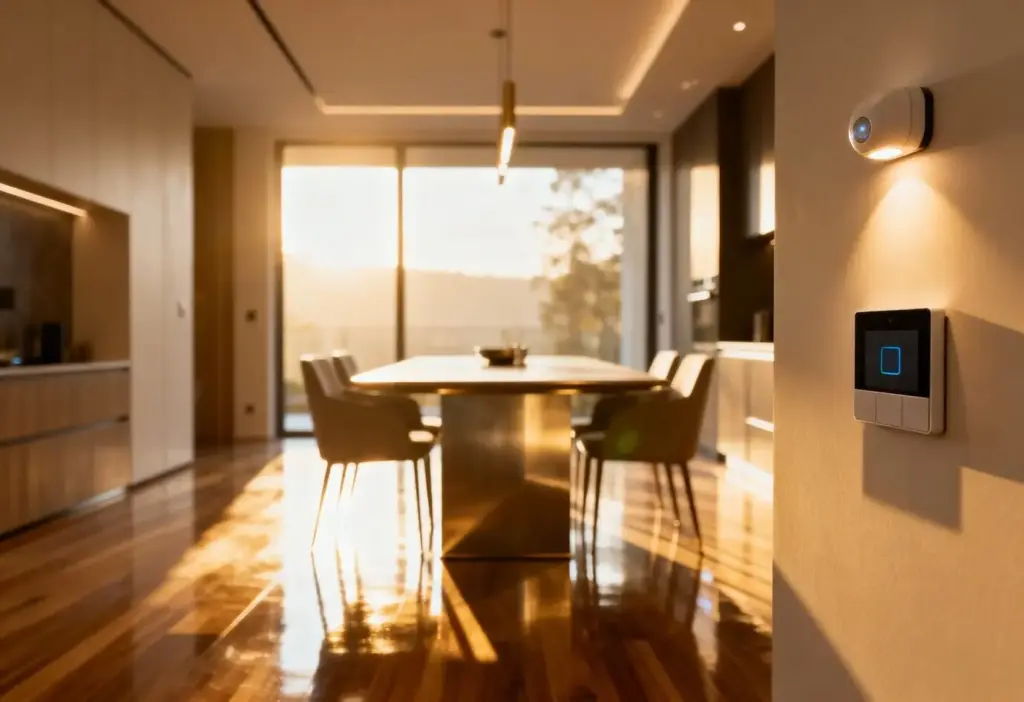
Bridging Physical and Digital Navigation
The best workplace journeys blend on-site cues with helpful pockets of digital guidance. Mobile maps, QR codes, and kiosks reinforce colored paths without overwhelming walls. Analytics reveal where people hesitate, informing targeted improvements. Keep privacy, accessibility, and offline reliability in mind so the experience remains inclusive, secure, and resilient during network hiccups or device limitations.

Scan, See, Go
Place discreet QR codes near key intersections to open accessible maps that mirror the color system. Provide alternate text for screen readers, step-free routes, and estimated walking times. Cache essentials for offline use. Keep the physical cue dominant; the scan simply confirms confidence. This light-touch approach supports guests without asking them to download yet another app.
Live Insights for Facility Teams
Anonymous, aggregated metrics from kiosks and opt‑in apps can highlight confusing junctions and chronic wrong turns. Pair these signals with feedback forms tied to locations. When a color path underperforms, adjust spacing, contrasts, or wording, then re-measure. A small dashboard helps prioritize fixes with real impact, turning anecdote into action and continuous improvement into everyday practice.
Safety-Ready Layers
Design your palette to cooperate with emergency overlays. During drills or alerts, digital screens and beacons can highlight evacuation colors, while physical routes remain unmistakable under low light. Avoid conflict with safety hues and maintain clear hierarchy. Practice scenarios with occupants and first responders, validating that stress-tested signals still guide calm, rapid movement to safe assembly points.
Atlas Labs: Speed and Calm
After mapping flows, Atlas Labs assigned Blue to engineering, Amber to client areas, and Green to amenities. Reception questions dropped by a third within a month, and average time-to-meeting fell by eight percent. A new-hire wrote, “I stopped asking strangers for directions on day two. The colors just make sense.” Maintenance praised durable edges that stayed crisp.
Merged Campus, One Language
Two companies combined buildings with clashing sign styles. Rather than pick a winner, they introduced neighborhood colors that respected both brands while prioritizing clarity. Cross-building journeys got primaries, local routes received tints. Orientation stalls at bridges disappeared. Employees said it felt like visiting friendly districts, not rival territories, and visitors found successive meetings less stressful and more punctual.
Governance, Training, and Continuous Improvement
Compile a concise guide with palettes, contrast ratios, typography, icon sets, and placement rules. Include do‑and‑don’t photos from your own corridors. Store swatches, vendor contacts, and approval workflows so updates remain consistent. Encourage suggestions through an easy form. Treat the guide as a living reference, reviewed quarterly to reflect real-world wear, technology changes, and organizational shifts.
Turn colors into shared language from day one. Offer five-minute tours that connect roles to routes, quick videos on internal channels, and desk cards reminding people how to direct guests: “Follow Blue to Labs.” Seasonal refreshers keep knowledge alive. When everyone understands the cues, new colleagues feel supported, and visitors experience consistent help from any friendly face.
Track time-to-destination for first-time users, wrong-turn frequency at key nodes, and reception interruptions per hour. Pair numbers with sentiment from short pulse surveys. Celebrate wins and close the loop on fixes. When leaders see minutes saved and stress reduced, investments in maintenance and thoughtful updates become easier, keeping clarity funded and flourishing through future change.