Color Above, Color Below: Shaping Open-Plan Life

Today we explore ceiling and floor color blocking to define open-plan areas, turning expansive rooms into legible, purposeful zones without building walls. By painting overhead planes, anchoring underfoot fields, and aligning hues with furniture and light, you can guide movement, create intimacy, and celebrate generous scale. Expect practical methods, honest stories, and smart details you can apply this weekend or plan for a bigger transformation.

Color Psychology Meets Open Flow

Color is a subtle compass that helps people intuitively understand where to gather, focus, and rest within an open-plan setting. By pairing ceiling and floor blocks, you reinforce cues from two directions, clarifying circulation while preserving openness. We’ll translate research into everyday choices you can trust, then encourage you to test swatches under your actual light and surfaces before committing to brave, confident strokes.

Palettes That Gently Guide Movement

Warm hues radiate energy and can pull people toward social hubs, while cooler tones recede, allowing passages to feel airy and calm. Extend these signals overhead and underfoot to subtly choreograph how friends drift from cooking to conversation. Test muted versions for sophistication, and reserve high chroma for accents where you truly want the eye to land.

Calm Corners, Lively Hubs

Reading nooks and work spots benefit from desaturated, low-contrast blocks that quiet distraction, especially when repeated on the ceiling to lower perceived height and create a cocoon. Dining or entertaining zones thrive with richer, warmer grounds. The combination of overhead envelope and floor field can create harmony without sacrificing the generous sweep of an open room.

Light and Culture Shape Perception

Morning sun softens blues, while evening lamplight deepens reds and ambers, changing how zones feel across the day. Cultural associations matter too: certain colors carry celebratory, serene, or formal meanings. Respect these nuances by sampling at different times, photographing comparisons, and inviting household feedback, ensuring the color blocking supports habits, emotions, and shared routines gracefully.

Mapping Zones from Ceiling to Floor

Ceiling Strategies: Bands, Panels, and Frames

Painted ceiling bands can visually stretch a room, while centered panels corral activity like a quiet halo. Frame a kitchen island with a contrasting overhead rectangle and pair it with directional pendants to anchor purpose. For tall spaces, deeper tones bring the plane closer, reducing echo and adding intimacy without heavy construction or costly millwork.

Floor Strategies: Rugs, Inlays, and Direction

Rugs act like movable walls, establishing footprint and softness simultaneously. Tile carpets or wood inlays provide permanence and crisp geometry, while changing plank direction can hint at a threshold. Echo the ceiling color family below, adjusting value for durability and maintenance. Use transitions deliberately, avoiding skinny slivers that feel accidental rather than designed.

Transitions That Feel Intentional

Where zones meet, consider a shared mid-tone, a slim contrasting reveal, or a material shift aligned with architectural lines. Aim for edges that resolve under furniture or lighting, not mid-walkway. Reinforce changes with a pendant cluster or floor lamp, and keep sightlines clean so color blocks read confidently from multiple angles without confusion or visual noise.

Materials, Finishes, and Durability

Open-plan areas work hard, so finishes must balance beauty with resilience. Ceiling paints benefit from flatter sheens to hide imperfections, while floors need colorfast materials that shrug off sun, spills, and scuffs. Choose performance first, then refine palettes. Sample generously, simulate wear in a test corner, and ensure cleaning routines will preserve crisp boundaries and the spirit of your design over time.

Light, Shadow, and Visual Height

Color reads differently under daylight, ambient glow, and focused beams. Plan blocks in concert with light sources so zones feel alive, not flat. Use reflectance values strategically to raise or lower perceived ceilings and widen or narrow floors. Trial dimmers, bulbs, and shade styles, ensuring your carefully drawn boundaries sing from breakfast brightness through midnight movie softness without losing clarity.

Budget, DIY, and Rental-Friendly Approaches

You can achieve striking clarity without major expense. Prioritize a single bold ceiling panel and a supportive area rug, then layer smaller accents. Use removable materials where needed and invest time in preparation. Community tips, borrowed tools, and thoughtful sequencing dramatically improve results. We welcome your questions, before-and-after photos, and clever hacks—share them so others can learn and celebrate alongside you.

Real-World Stories and Avoidable Mistakes

Practical examples reveal what measurements and mood boards sometimes miss. We share honest wins and stumbles so your next step feels confident. Learn how a studio gained privacy with a ceiling stripe, and how a bustling loft balanced family life through grounded floor fields. Add your experience in the comments, subscribe for more ideas, and bring questions we can troubleshoot together.

A Studio Finds Breathing Room

One renter painted a soft olive rectangle above a loveseat and added a woven rug echoing the hue. Suddenly the bed no longer dominated first impressions. Guests intuitively sat where conversation belonged. The olive receded at night, staying restful, while a small brass lamp sharpened edges, maintaining distinction without clutter or costly partitions.

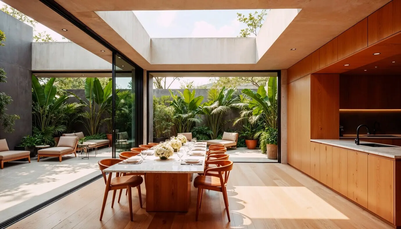
A Family Loft Gains Harmony

In a tall loft, a warm terracotta floor field under the dining table paired with a slightly deeper terracotta ceiling panel quieted echo and signaled togetherness. Nearby, a cool slate block anchored homework. Parents reported smoother transitions, fewer toy migrations, and easier cleanup because boundaries felt fair and obvious, not enforced or visually harsh.

Mistakes That Steal Clarity

Common missteps include too many colors, weak contrast, or edges that collide with door swings and vents. Skipping primer telegraphs repairs, and ignoring daylight throws carefully chosen hues off balance. Start with two complementary blocks, perfect the lines, evaluate for a week, then expand. Intentional restraint builds credibility and keeps the open plan feeling effortless.

Totulupoxoxaremaxe
Privacy Overview

This website uses cookies so that we can provide you with the best user experience possible. Cookie information is stored in your browser and performs functions such as recognising you when you return to our website and helping our team to understand which sections of the website you find most interesting and useful.